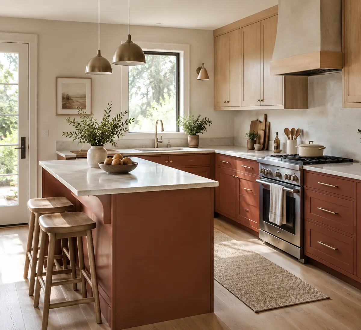
Designers are moving away from neutral kitchens and toward red, according to House Beautiful. The shades range from deep burgundy to earthy brick, and the appeal is simple: red feels warm, bold, and personal in a way an all-white room often doesn't.
But "bold" can sound risky, especially when you cook, eat, and pay bills in that room every day. This guide walks you through choosing a red you can live with, balancing it so it doesn't take over, and testing the idea for very little money.
Why red is replacing safe neutrals
Per the House Beautiful report, homeowners are getting tired of safe, all-white interiors. Richer, more expressive choices are gaining traction, and red kitchens fit a broader shift toward homes that feel personal, social, and energizing.
That last part makes sense for a kitchen in particular. It's the room where people gather, so a color with some warmth and personality suits how the space is actually used.
That's our read on it, not a rule. If you love your neutral kitchen, you don't need to change it. But if it feels flat, red is one way to fix that.
Step 1: Pick your red family
Red isn't one color. The trend spans a range, and the coverage points to burgundy at the deep end and brick at the earthy end. Think of it as choosing a mood:
- Burgundy: darker and richer. It reads moody and dramatic, and suits a kitchen where you want a cozy, enclosed feel.
- Brick: earthier and softer. It tends to feel familiar and grounded, which makes it a gentler entry point if bright red feels like too much.
If you're nervous, start on the brick side. Earthy tones tend to sit more easily beside wood and stone than a vivid, saturated red does.
Step 2: Test before you commit
Paint swatches look different in every kitchen because light changes the color. Before buying gallons:
- Buy sample pots of two or three reds.
- Paint large squares (about two feet wide) on poster board or directly on the wall.
- Look at them in morning light, afternoon light, and at night under your kitchen lights.
- Live with them for a few days before deciding.
A sample pot is a small cost compared with repainting cabinets in a shade you end up disliking.
Step 3: Balance red with neutrals
The practical advice behind this trend is about balance. Red works best when it has quiet partners around it. Keep the rest of the room calm and let the red be the star.
- Walls: if cabinets are red, keep walls in a soft neutral so the color has room to breathe.
- Countertops and backsplash: simple, light, or understated surfaces keep the look from feeling busy.
- Hardware and fixtures: choose one finish and stick with it so the eye has somewhere to rest.
A simple rule of thumb: one bold element per sightline. If the cabinets are red, let everything else support them.
Step 4: Add texture and natural materials
Neutrals and natural materials are the other half of this look. Texture keeps a strong color from feeling flat or heavy.
Wood is the easy answer: a butcher-block counter, open shelves, wood stools, or a cutting board display. Stone, woven baskets, linen towels, and ceramic dishes add softness. These pieces also tend to be easy to find secondhand or at low prices, so you can build the balance without a big spend.
Try red without repainting everything
Not ready for red cabinets? You can borrow the trend in smaller ways, and these work for renters and small kitchens too.
Under $25
- A red or brick-toned dish towel set
- A single ceramic bowl or pitcher in a deep red
- A bunch of seasonal flowers in a neutral vase to see how red accents feel beside your existing colors
A weekend project
- Paint a single piece, such as a small cart, a stool, or the inside of a open shelf, in burgundy or brick.
- Paint just the lower cabinets or an island and leave the uppers neutral. This limits the color and cuts down on paint.
- Paint a pantry door or the back of a bookshelf nook.
Renter-friendly
- A runner rug in a rust or brick tone
- Removable hooks with red-toned mugs or aprons
- Framed art with red in the palette
If you like how a small dose feels after a few weeks, that's your sign to go bigger. If it bugs you, you've lost almost nothing.
Small kitchens: a quick note
Deep colors can feel enclosing in a tight space, so be selective. In a small kitchen, try red on one feature, such as an island, a single wall of cabinets, or a door, and keep the rest light. Good lighting helps too, because a darker shade needs it to feel cozy instead of cave-like.
What red says about where home design is headed
The coverage frames this as part of a larger move toward homes with more personality. Instead of choosing the color that will offend no one, people are choosing the one that makes them feel something when they walk in.
That's a useful way to think about any decorating decision, red or not. A kitchen you've shaped to suit you will usually feel better than one designed to please a hypothetical buyer.
Your next move
Buy two sample pots, one burgundy and one brick, and paint them side by side on your kitchen wall this weekend. Look at them for three days. The one you keep glancing at is the one worth considering.