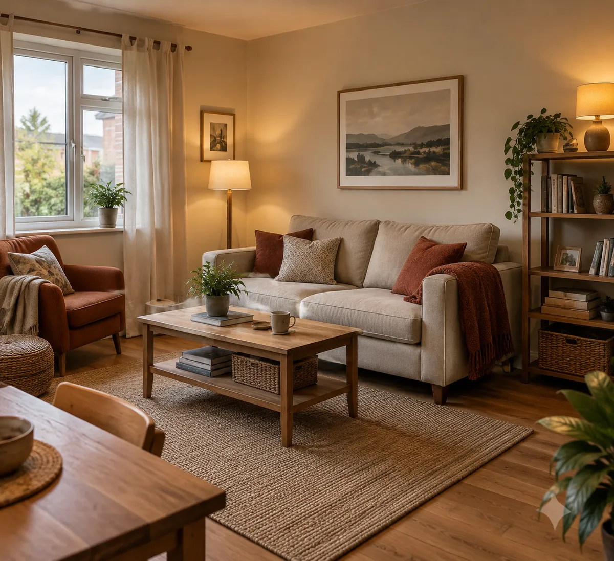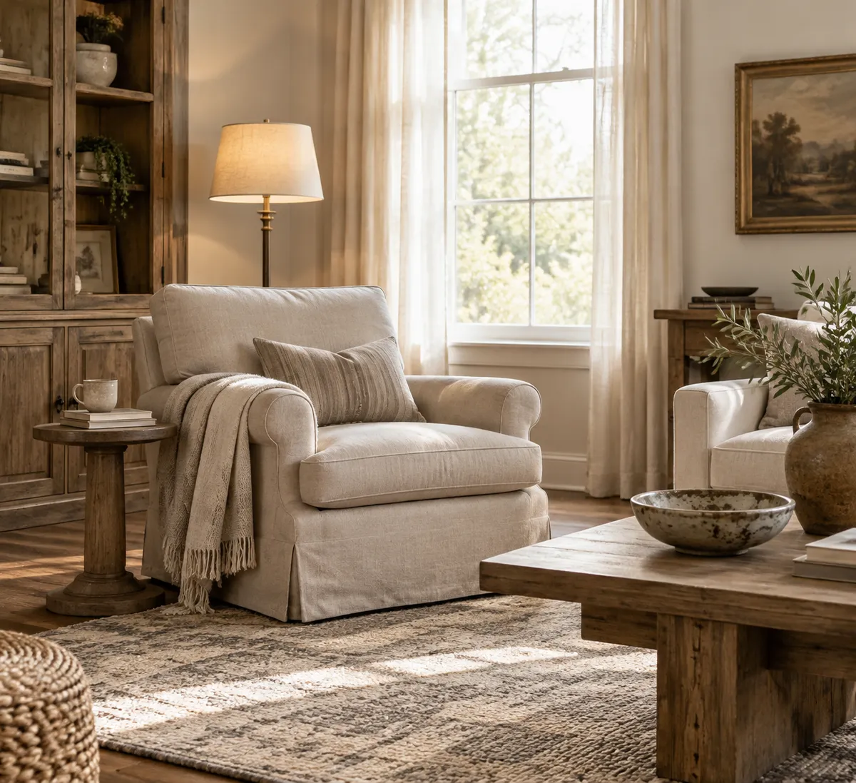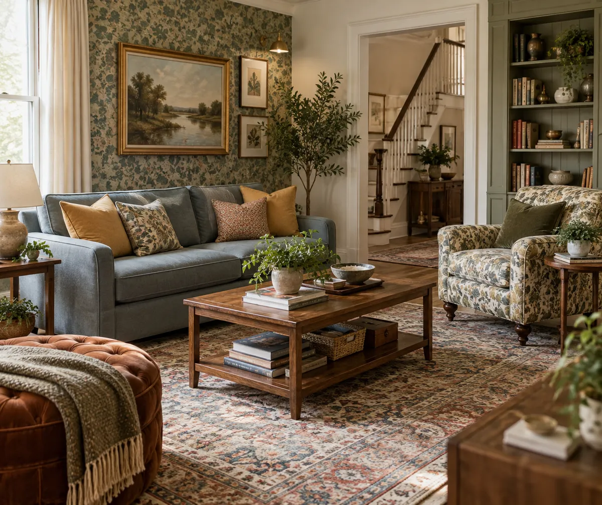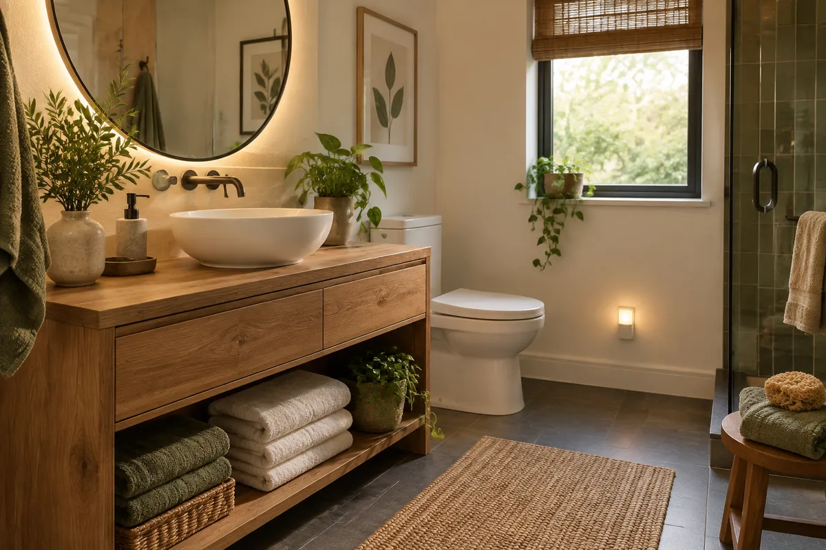
Paint is one of the cheapest ways to change a kitchen, which is exactly why a bad color choice stings. You spend a weekend taping and rolling, then spend years wincing every time you flip on the lights.
Per House Beautiful, designers point to six kitchen colors homeowners often regret: cool gray, black, bright yellow, stark white, red, and lime green. The common thread, according to the report, is that overly cold, stark, or saturated shades can make a kitchen feel unwelcoming, stressful, or hard to maintain.
Here's how to think through each one before you open a can, and how to keep the personality without the regret.
Why These Colors Backfire
A kitchen does double duty. It's a workhorse where you cook and clean, and it's a social hub where people gather. A color has to look good, feel good, and hold up to daily life.
With interiors trending warmer and softer, harsh or high-maintenance shades feel especially risky right now. That's the lens for everything below.
1. Cool Gray
Gray has been a go-to neutral, but a cool-toned version can turn a kitchen chilly. In a room where you want people to linger, that flat, cold feel works against you.
Try instead: a warmer neutral with a softer undertone. Hold the sample next to your countertops and flooring, since undertones clash faster than you'd expect.
2. Black
Black looks dramatic in photos. In a working kitchen, it can feel heavy, and dark finishes tend to be harder to keep looking clean. (That's my general observation, not a figure from the report.)
Try instead: keep black as an accent. Hardware, a faucet, light fixtures, or a single island give you the drama without the whole-room commitment. This is also the budget-friendly route, since swapping hardware costs far less than repainting all your cabinets.
3. Bright Yellow
It sounds cheerful, but a saturated yellow can read as stressful rather than sunny, especially across large surfaces and under strong light.
Try instead: a softer, more muted warm tone, or bring yellow in through small things like a bowl, a towel, or a vase of flowers you can swap anytime.
4. Stark White
Stark white can feel sterile and unwelcoming, more like a lab than a place for dinner. It can also show every splash and smudge.
Try instead: a softer, warmer white. You keep the bright, clean look but lose the clinical edge.
5. Red
Red is intense. On walls or cabinets it can dominate the room and feel overwhelming, particularly in a space you're in for hours.
Try instead: red in small doses. Think a runner, canisters, or a piece of art. If you love it, let it be the spark rather than the backdrop.
6. Lime Green
Lime is the boldest of the list. It's hard to pair with other materials and likely to feel dated or tiring faster than a quieter color.
Try instead: a gentler, more muted green if you want color. Or keep lime to something removable, like a stool or a small appliance.
A Simple Pattern: Warm Up the Base, Spice Up the Accents
Looking across all six, a rule emerges that's my own takeaway rather than a designer quote: put your safest, softest color on the big surfaces and your boldest color on things you can change cheaply.
That approach works at any budget and in any size kitchen. A small kitchen especially benefits, because a saturated or stark color has nowhere to hide.
How to Test Before You Commit
These steps cost almost nothing and can save you a repaint:
- Buy sample pots of two or three candidates instead of guessing from a chip.
- Paint large swatches on a couple of different walls, or on poster board you can move around.
- Check them at different times of day. Morning light, afternoon light, and evening lamps can each change the color.
- Look next to your fixed elements: countertops, backsplash, floors, and appliances.
- Live with them for a few days before you decide.
The Takeaway
Before you buy a gallon, ask whether the color will feel welcoming at 7 a.m. and at 9 p.m. If it's cold, stark, or loud, shift it warmer or softer, and save the bold choice for an accent you can swap in an afternoon.