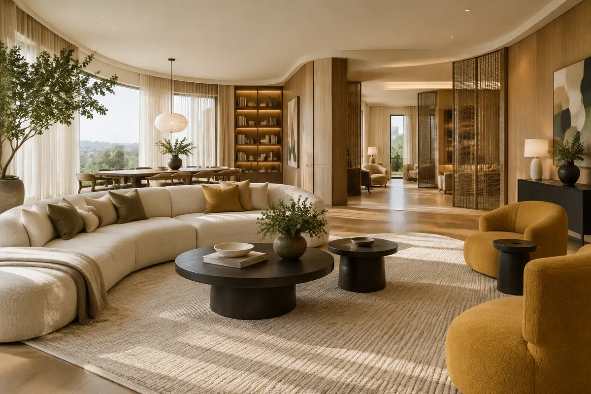
Got a layout that doesn't behave? A curve, a odd corner, a long skinny hallway? A Mumbai apartment recently profiled by Architectural Digest shows how to stop fighting the shape and start using it. The home is about 4,000 square feet, and its floor plan is shaped like a horseshoe.
You probably don't have 4,000 square feet. The thinking still scales down nicely, so let's pull out the lessons.
The Story in Brief
Per Architectural Digest, the home started as a pandemic purchase: two apartments joined into one, which left the plan curving around in a horseshoe. Studio PKA designed it for a couple and their daughter, who regularly flies in from the US. The result is described as calm and honey-toned.
The architects embraced the curve rather than hiding it. The horseshoe is also a traditional good-luck symbol, which gives the layout a nice bit of meaning on top of the function.
Lesson 1: Treat the Odd Shape as the Feature
According to the report, Studio PKA leaned into the curve. That's the mindset shift worth stealing.
Try this in your own place:
- Name the quirk. "Weird L-shaped living room" becomes "a room with a built-in reading nook."
- Follow the shape with your furniture. Let a sofa or shelving trace a bend instead of pushing everything flat against straight walls.
- Light the quirk. A single lamp or a wall washer on a curve or corner makes it look planned.
Cost: a lamp and a bulb, or nothing if you're just rearranging.
Lesson 2: Plan Privacy for Different People
This home needed to work for two generations, including a daughter who visits from abroad. Architectural Digest notes the architects planned privacy for both. The takeaway is that a shared home works best when everyone has a spot that feels like theirs.
You can do a small version of this:
- Give a guest or visitor one defined zone, even if it's a corner with a bed or daybed, a lamp, and a curtain or screen.
- Use soft dividers. A bookcase, a rug boundary, or a curtain track on the ceiling separates areas without construction.
- Think about sound. Rugs, curtains, and upholstered pieces take the edge off noise between zones.
These run from around the price of a curtain rod and panels to a modest bookcase, depending on what you pick.
Lesson 3: Pick One Design Language
Big or awkward homes can feel like a collection of unrelated rooms. The Mumbai project avoids that with a unified approach: the architects curated objects, artwork, and finishes from scratch, so everything speaks the same way.
You don't need a custom budget to copy the principle. Choose a tight palette and repeat it:
- Two or three main colors plus one accent. The honey tones in this home are a good example of a warm, simple anchor.
- One or two wood or metal finishes repeated from room to room.
- Consistent frames or hardware. Swapping mismatched cabinet pulls or picture frames is one of the cheapest ways to make a home look cohesive.
Thrift stores and secondhand shops are good for this. You're hunting for pieces in your chosen tones rather than for a matching set.
Lesson 4: Make Meaning Part of the Design
The horseshoe doubles as a good-luck symbol, and that gives the home a story. You can give your space one too, without it feeling forced.
Pick a single piece or motif that matters to you: a piece of art from a trip, a family heirloom on a shelf, a recurring shape. A home with one or two meaningful things tends to feel calmer than one filled with generic decor.
If You're Working With a Small Space
The same logic applies when square footage is tight:
- Embrace the shape: build into the awkward nook rather than leaving it empty.
- Create privacy in layers: curtains, screens, and rugs mark "zones."
- Limit your palette so a small home reads as one calm space.
- Add one meaningful object as your focal point.
Your Next Step
Stand in the most annoying spot in your home and ask what it would look like if you'd designed it that way on purpose. Then give that spot one lamp, one rug, or one piece of furniture that follows its shape. That's how a quirk starts reading as a choice.